
Kōri
Visual identity for a kakigōri bar
The brief
Kōri is a brand I imagined: a kakigōri bar, serving the finely shaved ice topped with syrup that is Japan’s summer dessert. This personal project let me build a complete identity, from the first idea to the shopfront.
My answer
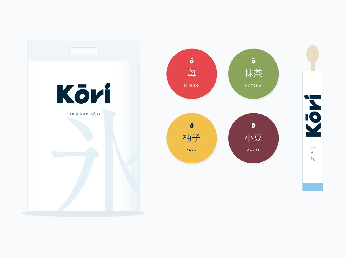
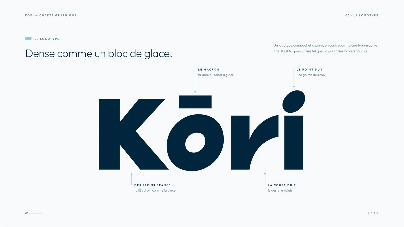
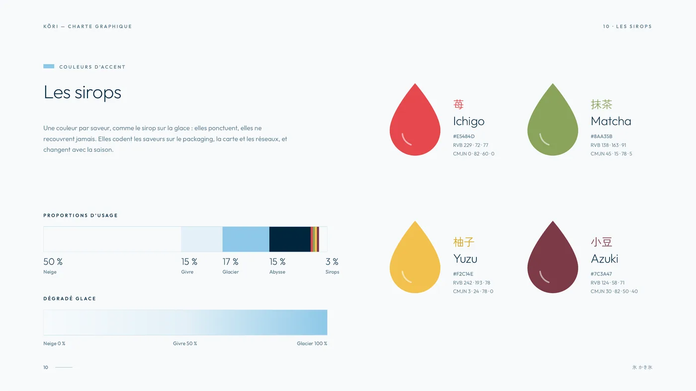
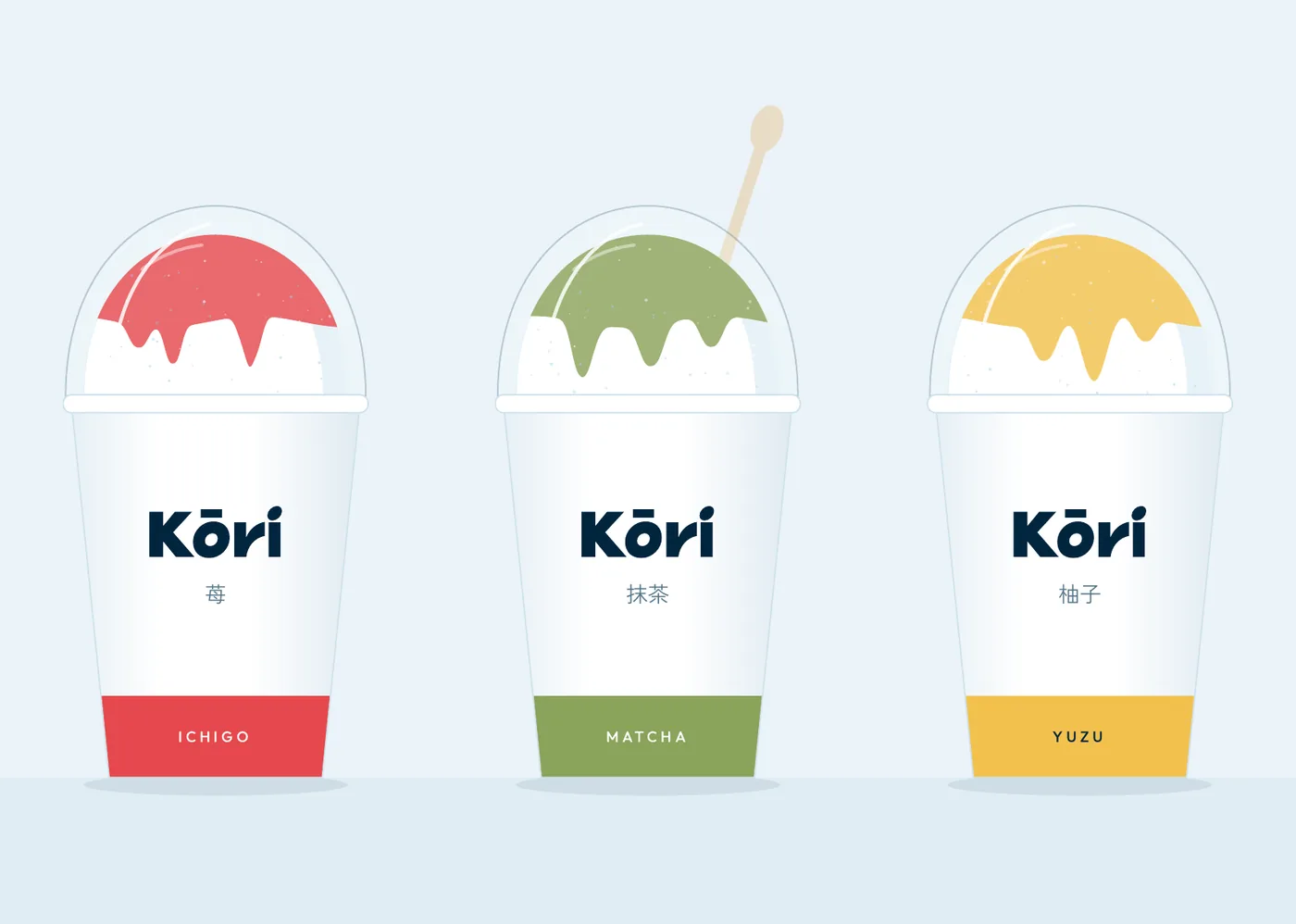
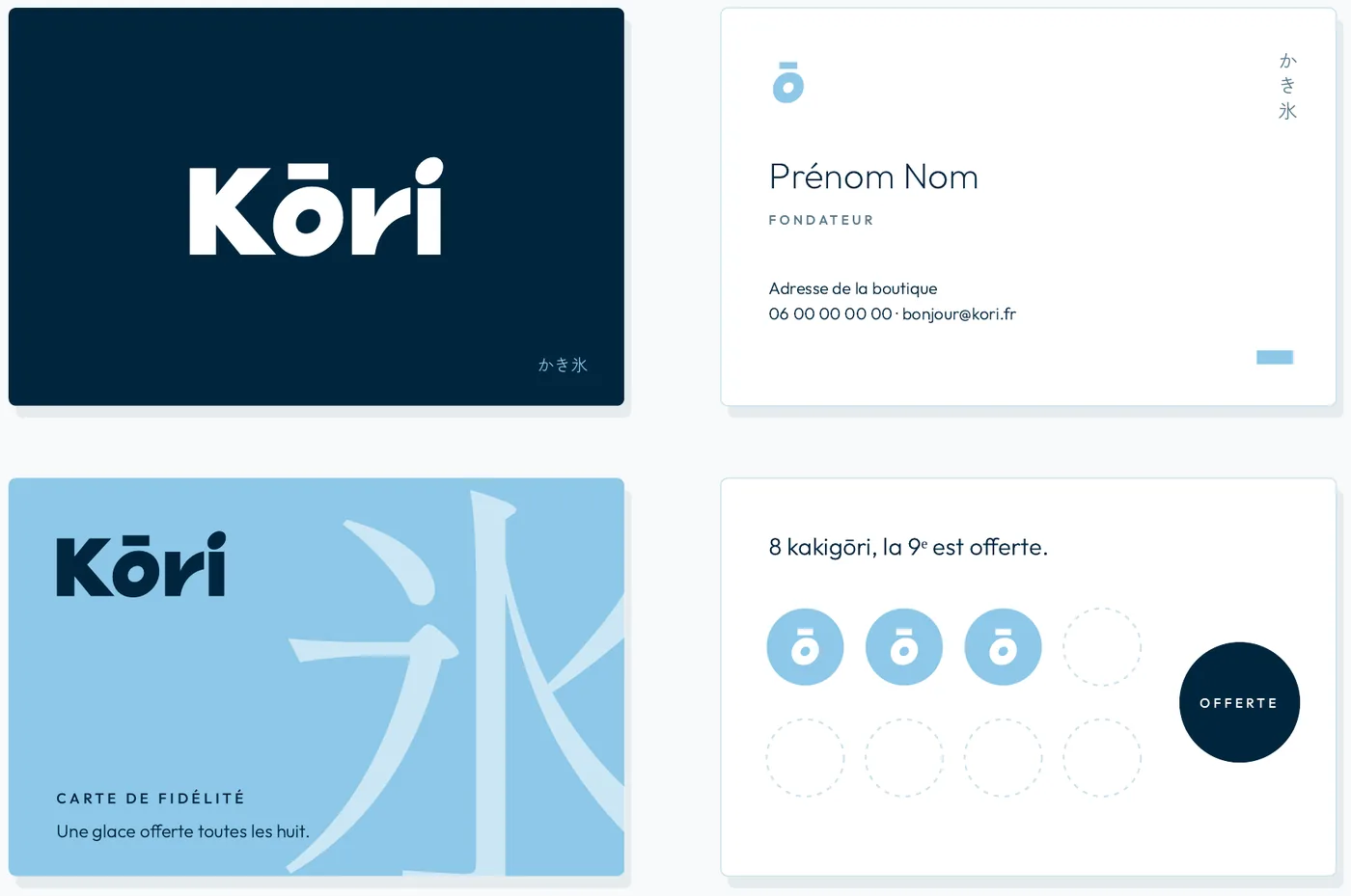
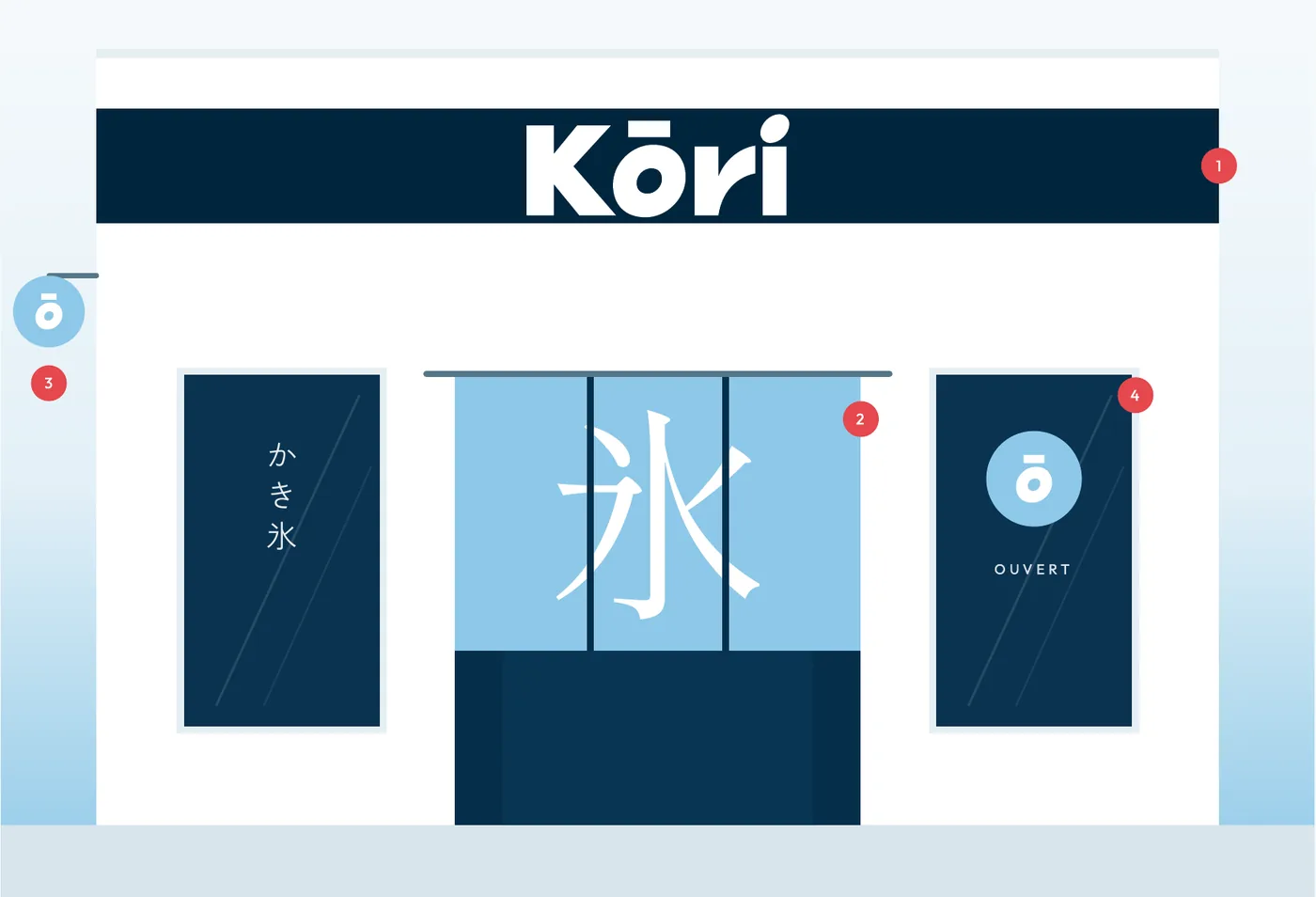
Kōri means “ice”. The logotype is as dense as a block of ice: the macron over the o recalls the blade of the ice shaver, the dot of the i a drop of syrup. The palette stays cool and bright, from snow white to glacier blue, and each syrup brings its own accent colour: strawberry, matcha, yuzu and azuki. The kanji 氷 as a watermark, the dome shape of the kakigōri and a crushed-ice dot pattern tie every item together.
Deliverables
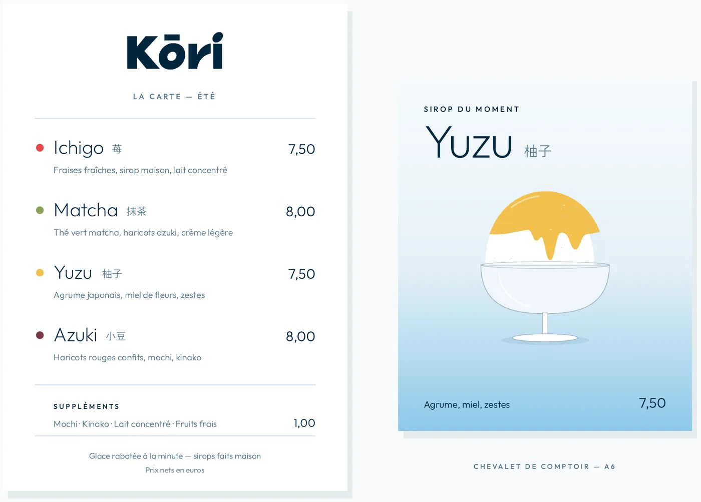
Logotype and monogram, colour palette, typefaces, illustrations and pictograms, complete brand guidelines as a PDF, then applications: cups, takeaway bags, business and loyalty cards, flavour menu, social media and shopfront.
The identity in detail.
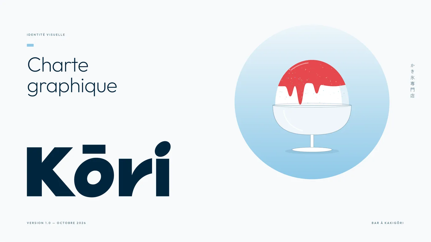
The first pages of the brand guidelines, then their applications. Download the document to read it in full (in French).
Credits — Graphic design: Jérémy Sauterel, personal project