
FFSU
Visual identity proposal
The brief
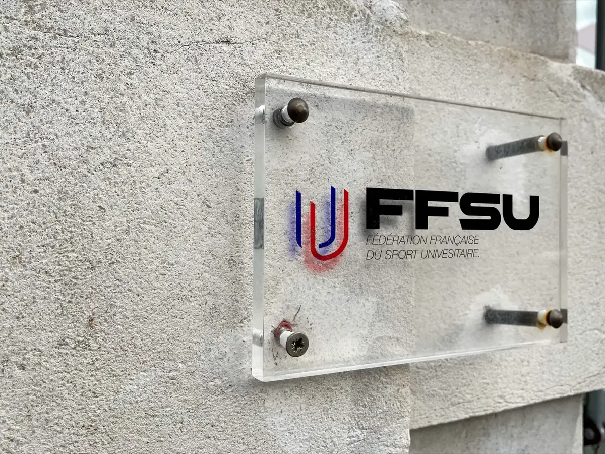
The French University Sports Federation (FFSU) launched a call for projects for its 2026–2027 visual identity. I answered it following its brief. This is an application proposal, not the official identity adopted by the federation.
My answer
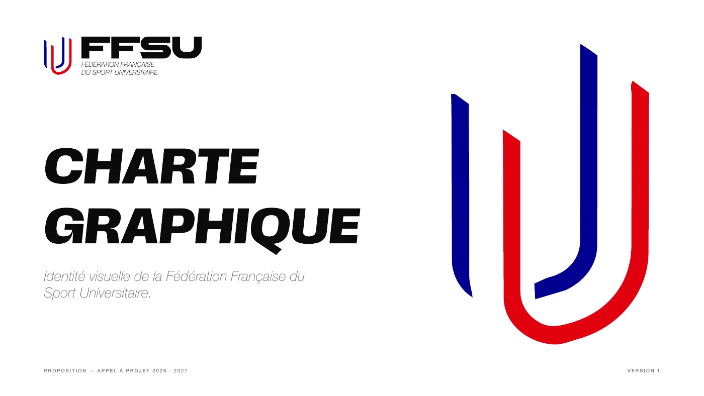
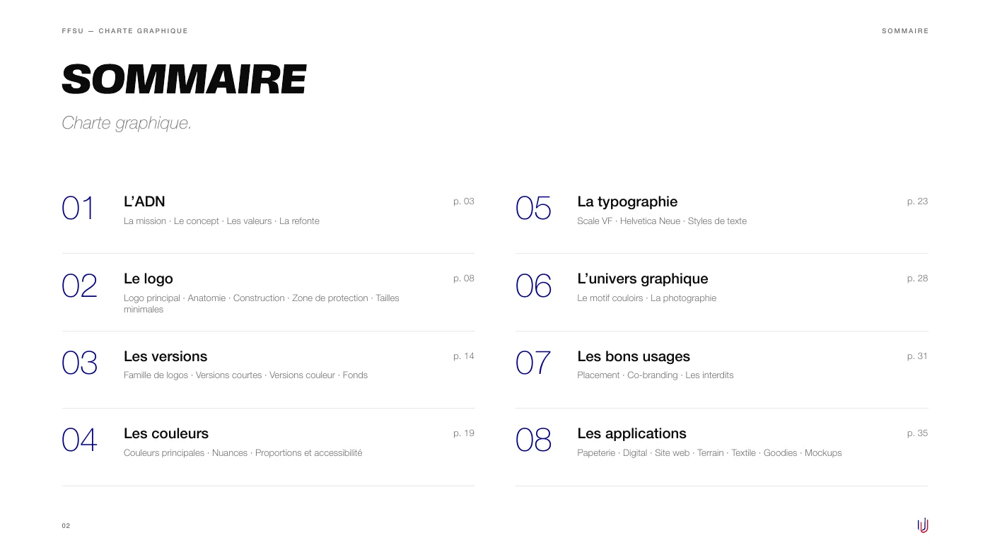
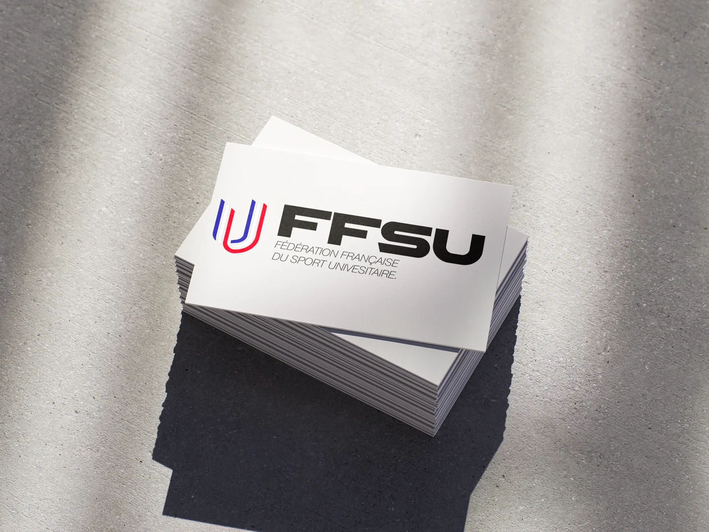
The symbol: two strokes, blue and red, that form a U, alongside the name FFSU in thick italic letters. The brand guidelines set out the brand’s DNA, the logo versions, colours, typeface and rules of use, then show the identity on real items.
Deliverables
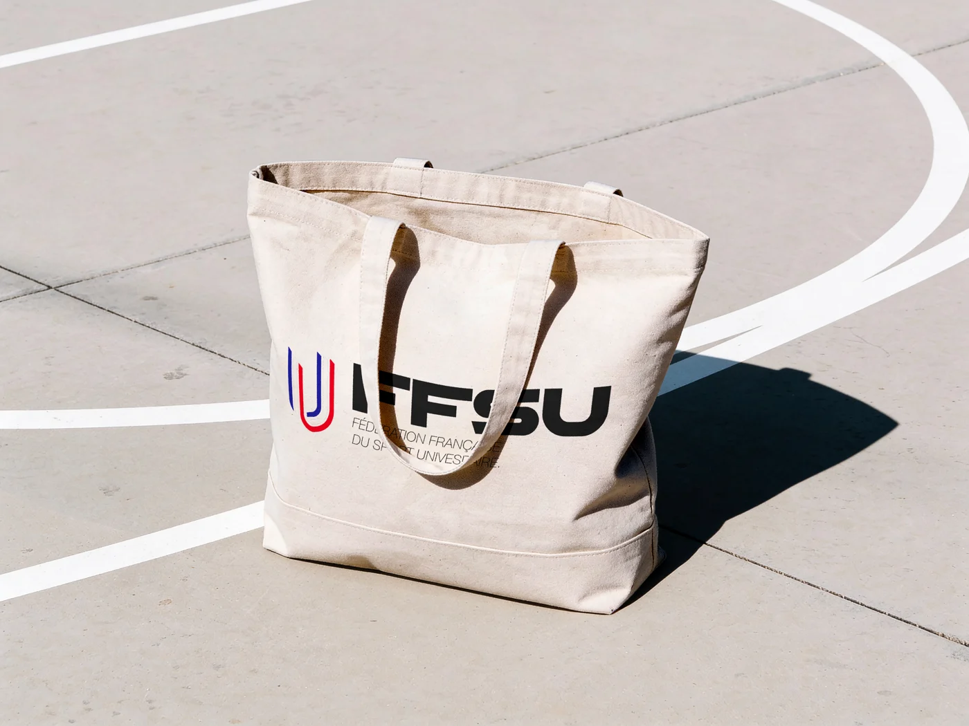
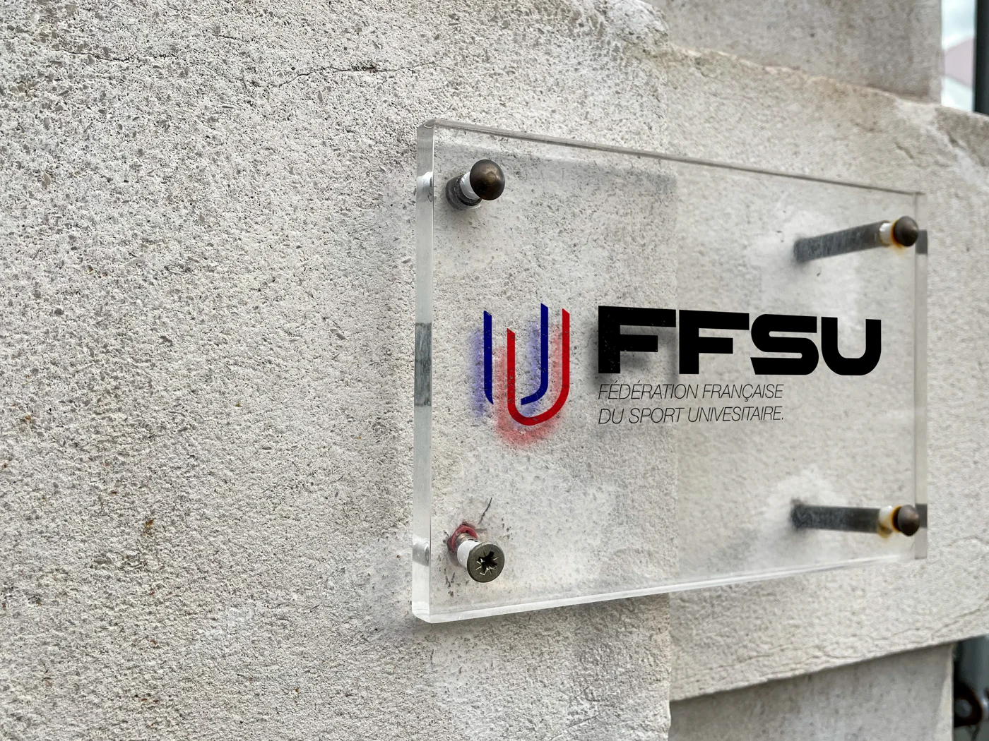
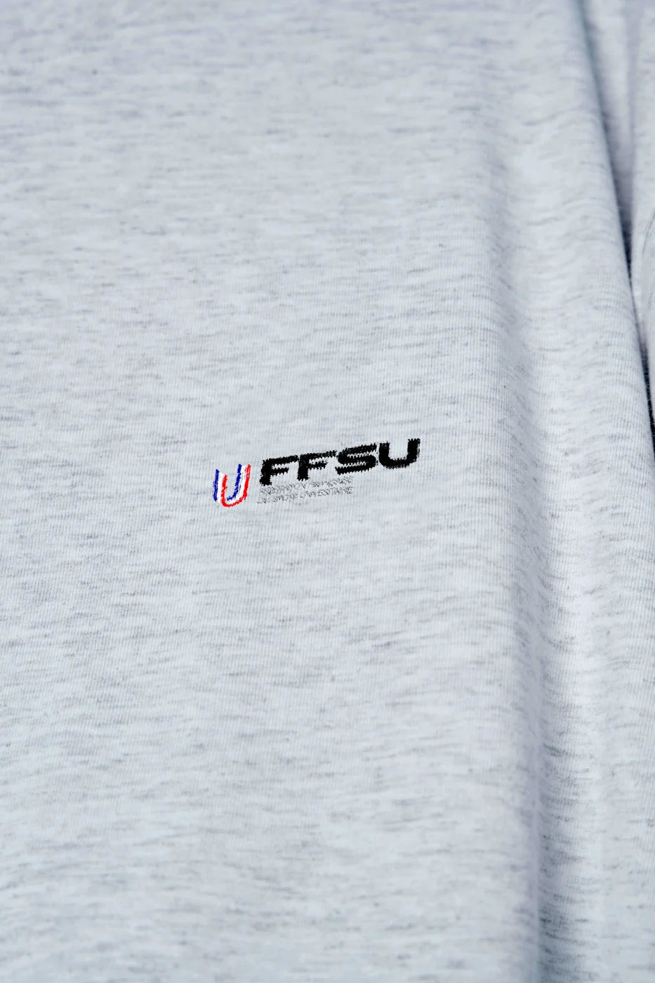
Logo and its versions, colour palette, typefaces, brand guidelines as a PDF and applications: stationery, signage, website, clothing and merchandise.
The identity in detail.
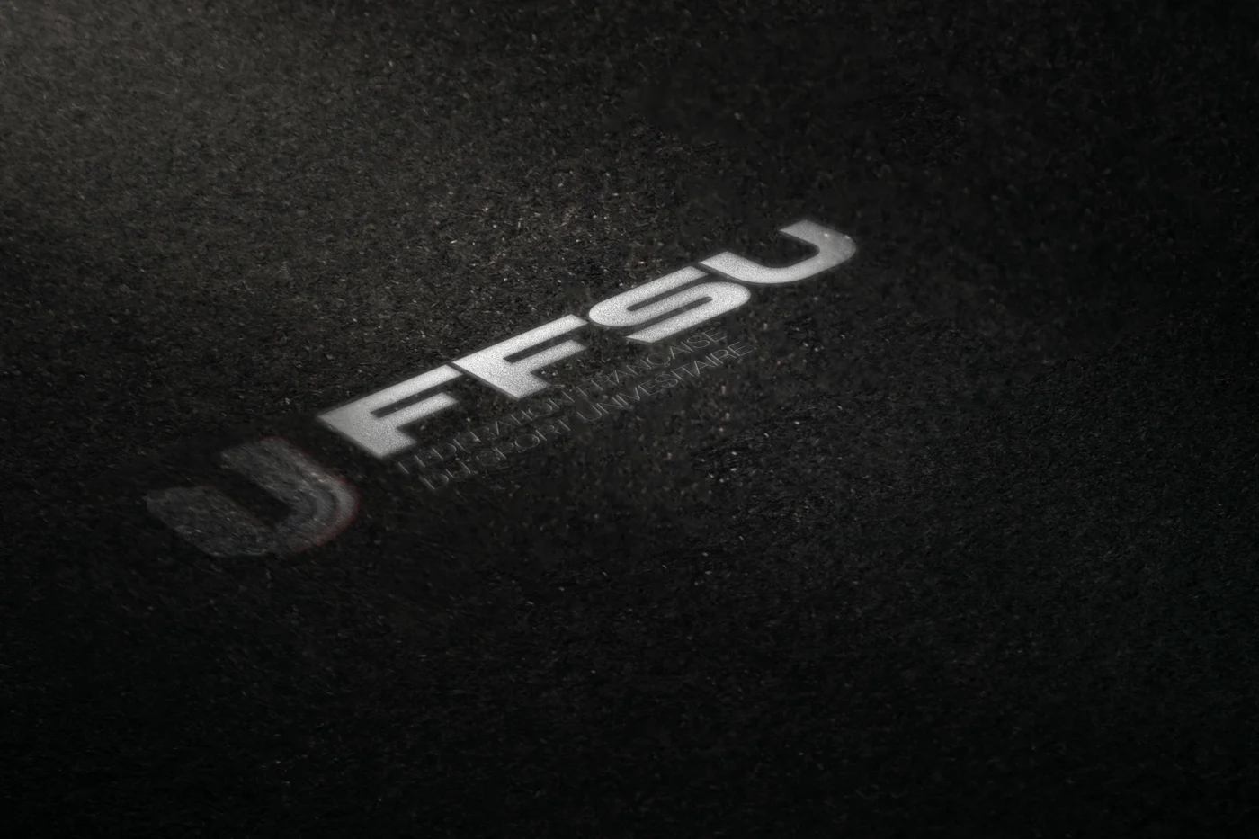
The first pages of the brand guidelines, then their applications. Download the document to read it in full (in French).

Credits — Graphic design: Jérémy Sauterel, as part of an application